Dallas County, Texas had at least one utility-reported grid event on 276 of the last 365 days. That's about three days out of every four. It tops a leaderboard pulled from a year of utility-reported event data: not customer complaints, not news reports, but what the utilities themselves logged.
The 25 counties below all crossed 250 event days in the last 12 months. If you run a solar, battery, or generator sales team, treat the list as a territory short-list: these are the counties where the grid fails often enough to knock on reputation alone.
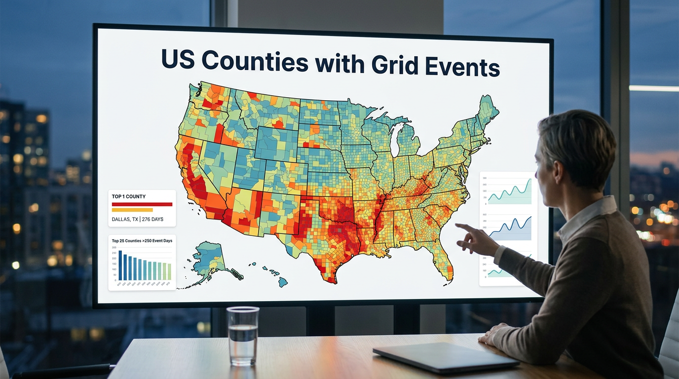
Which counties had the most grid-event days in the last 12 months?
Dallas, Texas leads with 276 event days, followed by Alameda, Cook, and Salt Lake at 274 each. The top 10:
| # | County | State | Event days | Total events | Avg customers | Max customers |
|---|---|---|---|---|---|---|
| 1 | Dallas | Texas | 276 | 6,000 | 92 | 25,466 |
| 2 | Alameda | California | 274 | 1,986 | 255 | 10,593 |
| 3 | Cook | Illinois | 274 | 5,346 | 101 | 63,645 |
| 4 | Salt Lake | Utah | 274 | 3,399 | 131 | 18,820 |
| 5 | Fulton | Georgia | 272 | 2,799 | 189 | 26,220 |
| 6 | Tarrant | Texas | 270 | 6,562 | 89 | 35,248 |
| 7 | San Bernardino | California | 269 | 1,621 | 714 | 96,650 |
| 8 | Orange | California | 269 | 1,513 | 548 | 35,847 |
| 9 | Maricopa | Arizona | 268 | 922 | 1,058 | 62,447 |
| 10 | Ventura | California | 267 | 1,002 | 634 | 26,082 |
Counties 11 through 25, by event days:
- Philadelphia, Pennsylvania: 265
- San Diego, California: 265
- Riverside, California: 264
- Montgomery, Texas: 263
- East Baton Rouge, Louisiana: 262
- Santa Clara, California: 259
- King, Washington: 256 (largest single event in the dataset: 122,136 customers)
- Jefferson, Alabama: 254
- Fresno, California: 254
- Kern, California: 253
- Montgomery, Pennsylvania: 252
- Baltimore, Maryland: 252
- Franklin, Ohio: 252
- Collin, Texas: 252
- Pinellas, Florida: 250
A few notes before reading further:
- Event days counts distinct calendar dates with at least one utility-reported event in the county. A county counts once for a date even if 50 events were logged that day.
- Total events is the raw count of utility records in the window. Many small events drive this number up faster than a few big ones do.
- Avg customers is the average customer count attached to each event. Max customers is the largest single event in the window.
Does an event-day mean the lights went out?
Not necessarily. This is utility-reported event data, not consumer-confirmed outage data. Utilities log a wide range of grid activity to systems like ODIN and EAGLE-I: planned switching, sub-feeder faults that self-cleared, equipment trips on backup paths, scheduled maintenance, and the obvious customer-facing events.
Some of these events affected nobody at home. Some affected a single block. Some affected tens of thousands of customers at once. The avg-customers and max-customers columns hint at the spread, but the same event-day count can hide very different on-the-ground experiences.
We report the data this way on purpose: we publish what the utilities themselves logged, and let the reader decide what to make of it. We covered why utility cause reporting is so inconsistent in a separate post.
Why are California counties so heavily represented?
Eleven of the 25 counties on the list are in California. The state has a lot of populous counties, but the bigger driver is California's reporting density. Three large investor-owned utilities (PG&E, SCE, SDG&E) plus a network of municipal utilities all report events into the same public datasets, so a single Bay Area county might get logged events from four or five different reporters in a year.
Texas takes 4 spots (Dallas, Tarrant, Montgomery, Collin). Pennsylvania has 2 (Philadelphia, Montgomery). The rest are spread across Illinois, Utah, Georgia, Arizona, Louisiana, Washington, Alabama, Maryland, Ohio, Florida, and Massachusetts. The state-level grid reliability picture lines up with most of those names.
What does the same number look like across different counties?
Two counties can sit next to each other at 270 event days and tell completely different stories. Look at three rows from the top 10:
- Tarrant, Texas logged 6,562 events across 270 days, averaging 89 customers per event. That pattern is many small, short records on the wire.
- Maricopa, Arizona logged 922 events across 268 days, averaging 1,058 customers per event. Fewer entries, each one larger when it landed.
- King, Washington logged 1,802 events across 256 days, but a single event hit 122,136 customers, the biggest of any county on the list.
Same neighborhood on the leaderboard, three different shapes underneath. That's why we publish all four columns instead of one ranking number. The metric you sort by changes which counties look interesting.
Where does this data come from?
Three public sources feed the table:
- EAGLE-I: The Department of Energy's utility event archive, covering all of 2025 across every state. This is the bulk of the 12-month window.
- ODIN: The DOE's real-time event feed, running continuously from late August 2025 onward. Fills the gap from late summer through the present.
- Direct utility scrapers: Roughly 25 utilities publish their own outage maps that we poll every few minutes. Most came online in late March 2026, so they contribute mainly to the last six weeks of the window.
We deduplicate overlapping reports so the same event doesn't double-count when two sources both pick it up. The result is a single record per county, per event, with whatever cause and customer-count metadata the utility supplied.
How does the recent picture compare to the 12-month list?
The 90-day list barely overlaps with the 12-month one. Over the last 90 days, Monroe County, New York and Erie County, New York both lead with 43 event days, and neither cracks the 12-month top 25. Tulsa County, Oklahoma sits at 42 days. Sullivan County, New York and several Oregon and Louisiana counties are right behind.
The shorter window weights the data toward our newest scrapers, which only came online in late March 2026 and report at finer granularity than the older archive. Over a year, EAGLE-I's broader-stroke reporting from California's IOUs and Texas's big-county utilities dominates the picture. The two windows aren't contradicting each other; they're showing the same grid through different lenses.
What can you do with this data?
Look at it for your county. The full list comes from public utility-reported events. Anyone can pull the same sources we did. If a county you work in is on the list, the underlying records are worth a closer look: when the events happened, which utility logged them, how many customers were attached, and which ZIPs they touched.
A free GridProfile report gives you that breakdown for any state and up to 3 counties: the same data the leaderboard is built from, sliced down to your territory. Whether the events on it are full outages, planned switching, or something in between is the next question to ask.